
Pete Phuaphan
About Me
A Business Insights and Analytics postgraduate student with experience in system engineering and digital marketing, actively seeking opportunities in data engineering, machine learning engineering, or analytics engineering, aims to leverage comprehensive knowledge and skills in data engineering tools such as SQL, Python, AirFlow, Databricks, Snowflake, dbt, and cloud platforms like AWS and GCP, along with hands-on experience in data analytics, particularly predictive analytics and machine learning. A team player and self-motivated, successfully initiating and completing several personal projects in data engineering and pipeline development, committed to using systematic problem-solving approaches to creating continuous improvement processes for automated data pipelines with high data quality and consistency that adapt to real-world data and foster empirical learning to deliver actionable business insights.
Check out my projects and see what I've been up to.
I’m currently learning
Python
Versatile programming language for data analysis, machine learning and AI.
Snowflake
Cloud-based data warehousing solution for scalable, secure data storage.
SQL
Standard language for managing and querying relational database systems.
Apache Airflow
Tool for orchestrating complex computational workflows and data processing.
Databricks
Unified, open analytics platform for building, deploying, and maintaining enterprise-grade data at scale.

dbt
SQL-first transformation workflow that follows software engineering best practices.
Here’s some of my work

Kaggle Spaceship Titanic
In this competition, the task is to predict whether a passenger was transported to an alternate dimension during the Spaceship Titanic's collision with the spacetime anomaly. To assist in making these predictions, a set of personal records, recovered from the ship's damaged computer system, is provided.
Considering that the original Titanic competition is already overwhelmed, as evidenced by the numerous submissions with a perfect prediction score of 1.0, I have decided to shift my project to the Spaceship Titanic instead.
TL;DR
Two datasets are provided: a training dataset and a testing dataset. The training dataset is used to train the machine learning model to predict whether a passenger has been transported or not, utilizing several features within the datasets, such as age, passenger ID, home planet, destination, expenses, and cryosleep. The data life cycle was adhered to, involving steps from exploratory data analysis (EDA) and handling missing values, to data wrangling and model training, employing Python libraries such as NumPy, Pandas, Matplotlib, and Scikit-learn. Consequently, the model successfully predicts whether a passenger has been transported or not on the testing dataset with an accuracy rate of 0.8.
EDA
Exploratory Data Analysis (EDA) is a crucial step in the data analysis pipeline, often conducted prior to formal modeling or hypothesis testing. The primary objective of EDA is to understand the structure, patterns, anomalies, and underlying relationships within the data.
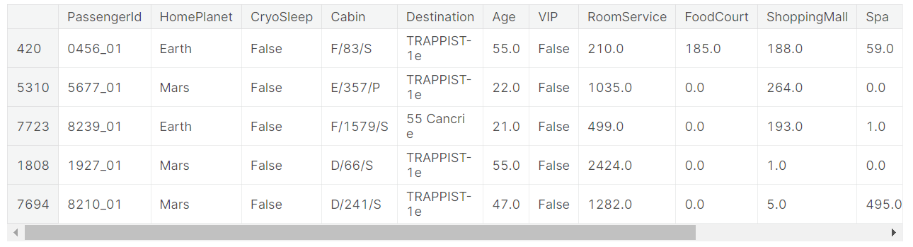
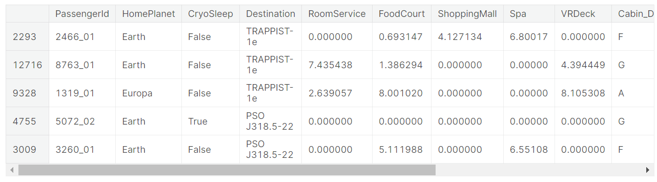
For this project, I started by using basic Pandas commands like .info(), .describe(), or .sample() to observe the characteristics of the dataset.
train.sample(5)
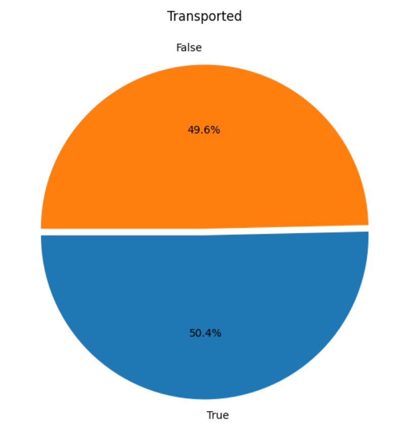
After that, I used the Matplotlib and Seaborn libraries to visualize the data. Typically, to observe the distribution of the data—in this case, the percentage between transported and non-transported passengers.
plt.figure(figsize=(10,7))

plt.pie(train['Transported'].value_counts(), labels=train['Transported'].value_counts().index, autopct='%1.1f%%', startangle=180, explode=[0.02,0.02])

plt.title('Transported')

plt.show()
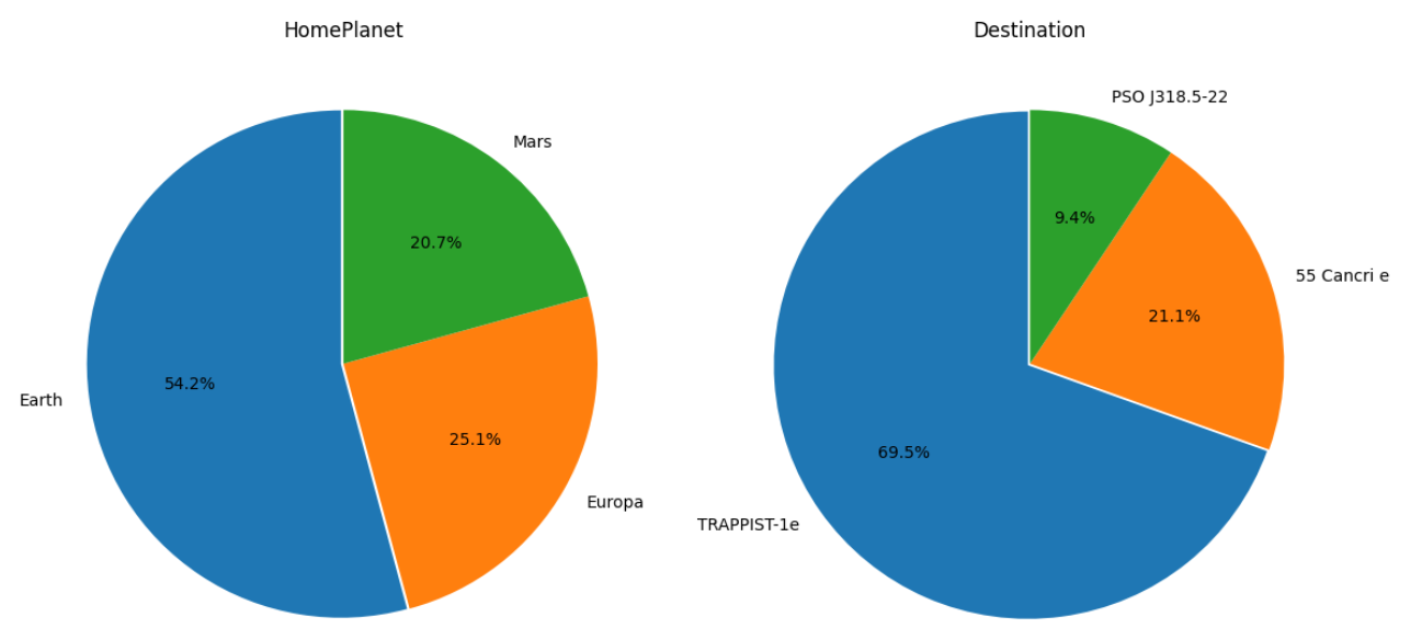
This two pie charts demonstrate that Earth is the home planet of most passengers, while TRAPPIST-1e is the destination for almost 70% of them.
fig=plt.figure(figsize=(12,8))
ax=fig.add_subplot(1,2,1)
plt.pie(train['HomePlanet'].value_counts(), labels=train['HomePlanet'].value_counts().index, autopct='%1.1f%%', startangle=90, explode=[0.01,0,0])
plt.title('HomePlanet')

ax=fig.add_subplot(1,2,2)
plt.pie(train['Destination'].value_counts(), labels=train['Destination'].value_counts().index, autopct='%1.1f%%', startangle=90, explode=[0.01,0,0])
plt.title('Destination')
fig.tight_layout()  # Improves appearance a bit
plt.show()
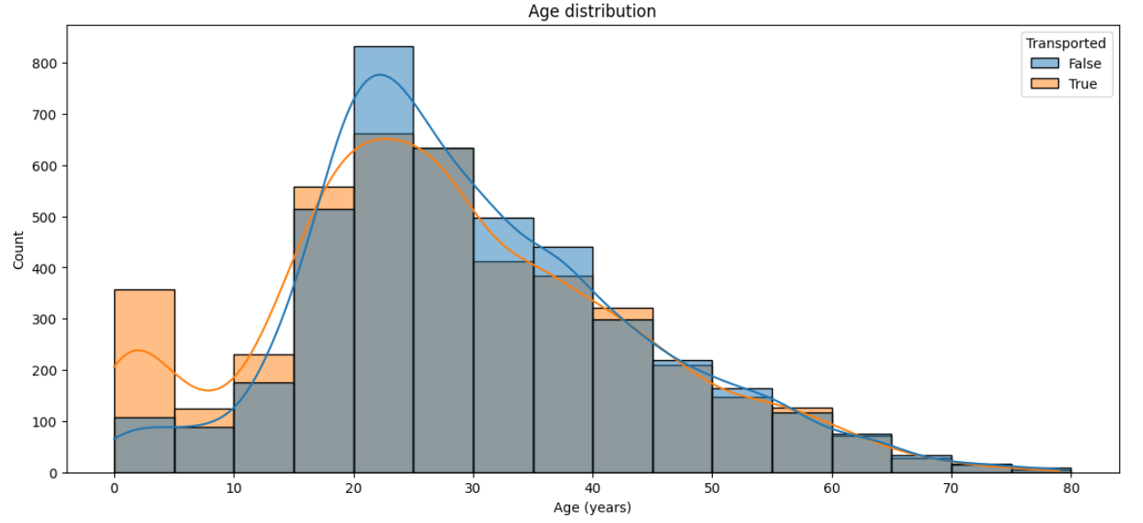
A histogram is suitable for displaying the age distribution among passengers, and by adding the 'hue' parameter, it enables us to notice that passengers aged 0-20 are more likely to be transported than those in other age groups.
# Figure size
plt.figure(figsize=(14,6))

# Histogram
sns.histplot(data=train, x='Age', hue='Transported', binwidth=5, kde=True)

# Aesthetics
plt.title('Age distribution')
plt.xlabel('Age (years)')
plt.show();
Handle missing values
I decided to merge two datasets and handle missing values collectively, with the intention of separating them again later.
According to the Data Field Descriptions, I split PassengerId and Cabin into separate features.
PassengerId - A unique Id for each passenger. Each Id takes the form gggg_pp where gggg indicates a group the passenger is travelling with and pp is their number within the group. People in a group are often family members, but not always.
Cabin - The cabin number where the passenger is staying. Takes the form deck/num/side, where side can be either P for Port or S for Starboard.
data[['Passenger_Group', 'Passenger_MemberID']] = data['PassengerId'].str.split('_', expand=True)
data[['Cabin_Deck', 'Cabin_Num','Cabin_Side']] = data['Cabin'].str.split('/', expand=True)

# Change type to int
data['Passenger_Group'] = data['Passenger_Group'].astype(int)
data['Passenger_MemberID'] = data['Passenger_MemberID'].astype(int)
I also created a new feature, 'GroupSize', by obtaining the maximum number in 'Passenger_MemberID' for each 'Passenger_Group' to determine the size of the group.
# new feature
group_counts = data.groupby('Passenger_Group')['Passenger_MemberID'].max()
data['GroupSize'] = data['Passenger_Group'].map(group_counts)
data['GroupSize'] = data['GroupSize'].astype(int)
I also discovered that all passengers in a specific cabin deck are from the same HomePlanet. For instance, passengers in cabins deck B and C are from Europa, whereas those in cabins G are from Earth
Essentially, this information can be used to populate records with missing HomePlanet data with 99% confidence.
cabin_deck_feats = ["B","C", "D", "E", "F", "G"]

fig=plt.figure(figsize=(10,12))
for i, var_name in enumerate(cabin_deck_feats):
    ax=fig.add_subplot(3,2,i+1)
    sns.countplot(data=data[data['Cabin_Deck']==var_name], x='HomePlanet')
    ax.set_title(f"Homeplanet of passengers in cabin deck {var_name}")
fig.tight_layout()
plt.show()
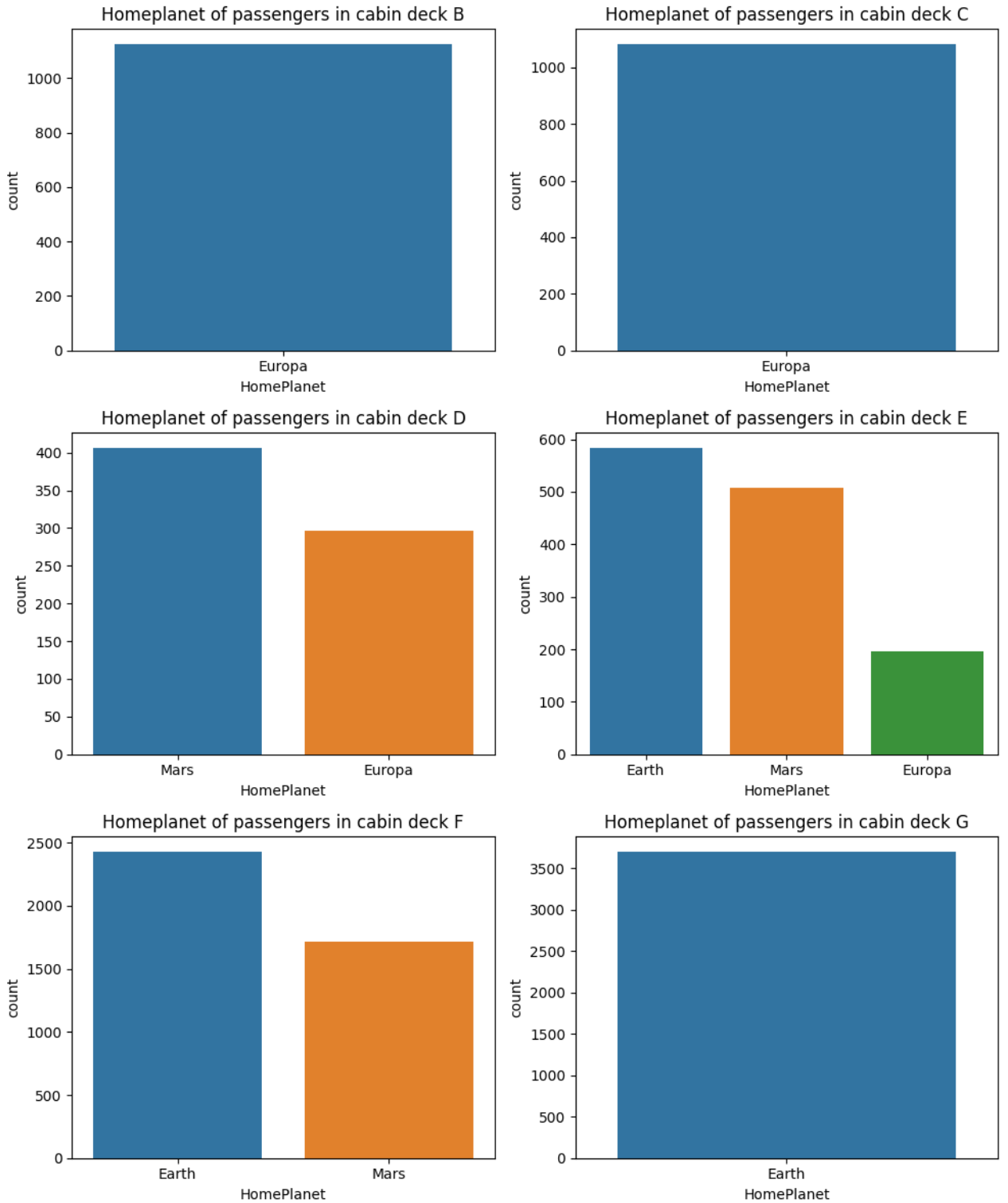
Unfortunately, we are unable to use the same approach with missing destinations as passengers on any particular deck might have different destinations.
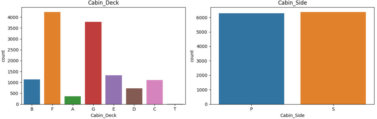
The insight we obtained from these plots indicates that the cabin side is evenly distributed between P and S, and Decks F and G appear to be the largest, accommodating the most passengers.
This insight will be utilized to populate the missing cabin deck and side values.
cabin_feats = ["Cabin_Deck", "Cabin_Side"]

fig=plt.figure(figsize=(12,4))
for i, var_name in enumerate(cabin_feats):
    ax=fig.add_subplot(1,2,i+1)
    sns.countplot(data=data, x=var_name, axes=ax)
    ax.set_title(var_name)
fig.tight_layout()  # Improves appearance a bit
plt.show()
All passengers within the same group came from the same HomePlanet as output is empty
grouped = data.groupby("Passenger_Group")["HomePlanet"].nunique()
                          grouped[grouped>1]
output: Series([], Name: HomePlanet, dtype: int64)
Filling missing values
Starting with those of the highest confidence.
All passenger in Deck A,B,C have the same HomePlanet of Europa, while all passengers in Deck G is earth
cond = (data["Cabin_Deck"]=="A")|(data["Cabin_Deck"]=="B")|(data["Cabin_Deck"]=="C")
data.loc[cond, 'HomePlanet'] = 'Europa'
cond = data["Cabin_Deck"]=="G"
data.loc[cond, 'HomePlanet'] = 'Earth'
Fill missing 'HomePlanet' values according to the insight that all passengers within the same group came from the same 'HomePlanet.
data['HomePlanet'] = data.groupby('Passenger_Group')['HomePlanet'].transform(lambda x: x.fillna(method='ffill').fillna(method='bfill'))
Function to fill NaN based on the weighted probabilities
This function created to fill missing target based on a probability distribution in combination of ralated features
def fill_missing_ratio(row, feats, target):
    if pd.isna(row[target]):
        try:
            indices = tuple(row[feat] for feat in feats)
            weights = grouped.loc[indices]
            return np.random.choice(weights.index, p=weights.values)
        except:
            return row[target]
    return row[target]
For example below, passengers on Deck A, whose destination is '55 Cancri e,' have a probability of 1 that their home planet is Europa.
On the other hand, passengers on Deck D with the same destination, '55 Cancri e,' are likely to have Europa as their home planet with a probability of 0.59 and Mars with a probability of 0.41.
target = "HomePlanet"
feats = ['Cabin_Deck', 'Destination']
grouped = data.groupby(feats)[target].value_counts(normalize=True).unstack(fill_value=0)
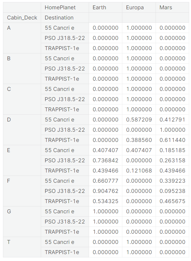
When it comes to filling the missing 'HomePlanet' of a passenger who stays on Deck D and is traveling to planet '55 Cancri e,' the function will fill the missing value with either Europa or Mars, randomly, with weighted ratios of 0.59 and 0.41, respectively.
This function will facilitate a quicker and easier filling of missing values, especially in cases where populating missing values with 99% confidence is unattainable.
I repeated the process to fill some of the missing values such as 'Cabin_Deck' and 'Cabin_Side' values.
# Filling missing 'Destination' based on a probability distribution in combination of ralated features
target = "Destination"
feats = ['HomePlanet', 'Cabin_Deck']
grouped = data.groupby(feats)[target].value_counts(normalize=True).unstack(fill_value=0)
data[target] = data.apply(fill_missing_ratio, args=(feats, target), axis=1)
Missing CryoSleep
CryoSleep appears to have a relationship with spending, as passengers in CryoSleep are less likely to spend.
spending_feats = ['RoomService','FoodCourt','ShoppingMall','Spa','VRDeck']
data[spending_feats] = data[spending_feats].fillna(0)
data["Total_Spent"] = data[spending_feats].sum(axis=1)
data["Has_Spent"] = (data["Total_Spent"] > 0).astype(int)

fig=plt.figure(figsize=(10,6))
sns.countplot(data=data, hue='Has_Spent', x='CryoSleep')
fig.tight_layout()  # Improves appearance a bit
plt.show()
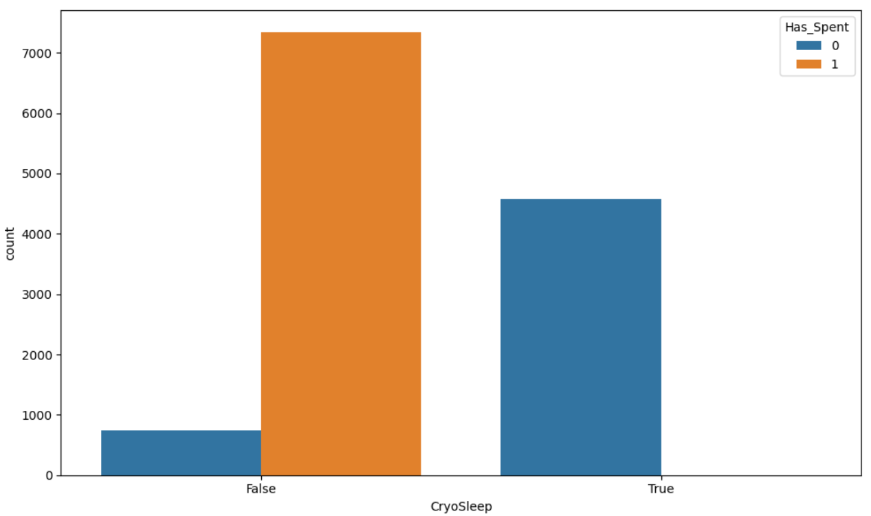
The missing 'CryoSleep' values are filled based on the assumption that passengers who spent money were not in cryosleep; otherwise, missing 'CryoSleep' values are filled with 'True'.
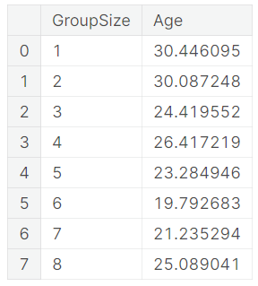
Missing Age
The average age is different for each group size. Fill missing age by using average age of the same group size instead of using average age of all passengers.
data.groupby('GroupSize')['Age'].mean().reset_index()
Feature engineering
Start from allocate individuals into consecutive age groups, each spanning ten years: 0-10, 11-20, 21-30, and so forth.
# Define the age bins and labels
bins = [0, 10, 19, 29, 39, 49, 59, 69, 79, 89, 99]
labels = [1, 2, 3, 4, 5, 6, 7, 8, 9, 10]

# Create the agegroup column
data['agegroup'] = pd.cut(data['Age'], bins=bins, labels=labels, right=True, include_lowest=True)
Apply a log transform to 'expenses' to normalize the scale and reduce skewness.
for col in ['RoomService','FoodCourt','ShoppingMall','Spa','VRDeck','Total_Spent']:
    data[col]=np.log(1+data[col])
Preparation & Encoding
At this step, I remove unwanted features, encode categorical data, and apply a scaler to numerical data.
data.drop(['Age', 'VIP','Passenger_Group','Passenger_MemberID','Cabin_Num','Firstname','Lastname'], axis=1, inplace=True)
data.sample(5)
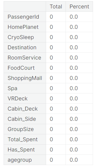
Confirm whether there are no remaining missing values.
missing_percentage(data)
Split the data back into test and train datasets, and further divide the train dataset using a 75/25 ratio to train the machine learning model.
X=data[data.index.isin(train['PassengerId'].values)].copy()
X_sub=data[data.index.isin(test['PassengerId'].values)].copy()
X_train, X_test, y_train, y_test = train_test_split(X, y, test_size=0.25, random_state=0)
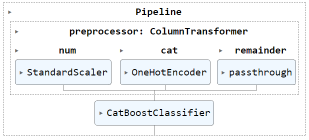
Categorical data, such as HomePlanet and Destination, will be encoded with OneHotEncoder, while StandardScaler() will be applied to numerical data, such as CryoSleep and Total_Spent.
numerical_cols = ["CryoSleep", "GroupSize","Total_Spent","Has_Spent","agegroup",'RoomService','FoodCourt','ShoppingMall','Spa','VRDeck']
categorical_cols = ["HomePlanet","Destination", "Cabin_Deck", "Cabin_Side"]

# Scale numerical data to have mean=0 and variance=1
numerical_transformer = Pipeline(steps=[('scaler', StandardScaler())])

# One-hot encode categorical data
categorical_transformer = Pipeline(steps=[('onehot', OneHotEncoder(drop='if_binary', handle_unknown='ignore',sparse_output=False))])

# Combine preprocessing
preprocessor = ColumnTransformer(
    transformers=[
        ('num', numerical_transformer, numerical_cols),
        ('cat', categorical_transformer, categorical_cols)],
        remainder='passthrough')

clf = Pipeline(
    steps=[("preprocessor", preprocessor), ("CBclassifier", CatBoostClassifier(iterations=1500,
                         eval_metric='Accuracy',
                        verbose=0))]
)
Train model & Evaluate
clf.fit(X_train, y_train)
Now it's to evaluate model accuracy
y_pred = clf.predict(X_test)
pred_acc = accuracy_score(y_test, y_pred)
print(f"Accuracy score is : {pred_acc:.4f}")
Accuracy score is : 0.8073
As we can see, there is room for improvement in handling missing values and feature engineering, as well as in training with different models, for example, LogisticRegression and RandomForest, and then choosing the model with the highest accuracy score.
Make prediction
Re-train the model with the entire dataset before allowing it to predict the test dataset.
clf.fit(X, y)
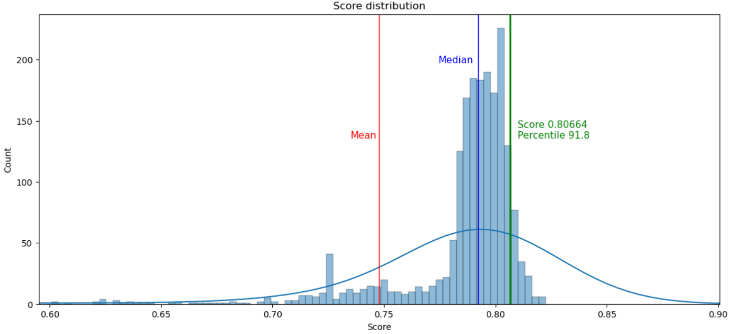
After making a prediction on the test dataset and submitting it, my score was 0.80664, which is in the 91.8th percentile.
Prediction score : 0.80664

Compare Financial Ratios
While studying in the Managerial Accounting and Finance course, there's a assignment to calculate financial ratios (long-term, short-term, profitability, and market value) for two different companies and to compare them in order to determine which company is the more favorable choice for investment.
TL;DR
Even though this is a traditional finance course, not a programming course, I decided to apply my knowledge and skills in Python and Data Analytics to this assignment. I used Python to retrieve financial reports via the Yahoo Finance API. Then, I performed calculations and created graphs to visualize the data. Furthermore, I created chart to display historical returns for the past three years, including the correlation between the two companies.
Another advantage of using a programmatic approach is that I can compare any companies for which financial data is available on Yahoo Finance.To enhance the accessibility of this project, I have uploaded the code to GitHub and utilized Streamlit to transform it into a website as below.
https://compare-financial-ratios.streamlit.app/
I utilized the yfinance library to retrieve various financial data, such as the balance sheet, cash flow, income statement, and historical share prices. A function I developed utilizes this data to calculate several financial ratios, such as Total Asset Turnover, Receivables Turnover, and Return on Assets. All the calculated ratios for the two companies are consolidated into a single dataset, which is subsequently used to generate a chart that visualizes trends and facilitates the comparison of performance
Upon completion, I leveraged Streamlit—a service that converts Python scripts into shareable websites. I configured Streamlit to connect with my GitHub, where the project’s source code stores, thereby rendering a website that is accessible to all.

Capture sales seasonality using Fourier transforms and periodograms
When a set of data, especially a sales report, has a pattern that repeats at regular intervals, such as daily, weekly, or annually, we call it "seasonal".
In this project, given only average sales data for building a prediction model, I'll use Fourier Features and the Periodogram to capture seasonality in sales reports and determine if this feature can predict sales. Root Mean Squared Logarithmic Error will be used as evaluation metric.
# Read the data
train = pd.read_csv("/kaggle/input/store-sales-time-series-forecasting/train.csv")

# Clean and preprocess the dataset
train = (train.drop(columns='onpromotion')
        .assign(date=lambda df: pd.to_datetime(df['date']))
        .query("date >= '2017'")
        .assign(id=lambda df: df['id'].astype(int),
                date=lambda df: df['date'].dt.to_period('D'))
        .set_index(['store_nbr', 'family', 'date'])
        .sort_index())

# Compute the average sales
average_sales = train.groupby('date')['sales'].mean().squeeze()
Use plot_periodogram function to see seasonality
def plot_periodogram(ts, detrend='linear', ax=None):
    from scipy.signal import periodogram
    fs = pd.Timedelta("365D") / pd.Timedelta("1D")
    freqencies, spectrum = periodogram(
        ts,
        fs=fs,
        detrend=detrend,
        window="boxcar",
        scaling='spectrum',
    )
    if ax is None:
        _, ax = plt.subplots()
    ax.step(freqencies, spectrum, color="purple")
    ax.set_xscale("log")
    ax.set_xticks([1, 2, 4, 6, 12, 26, 52, 104])
    ax.set_xticklabels(
        [
            "Annual (1)",
            "Semiannual (2)",
            "Quarterly (4)",
            "Bimonthly (6)",
            "Monthly (12)",
            "Biweekly (26)",
            "Weekly (52)",
            "Semiweekly (104)",
        ],
        rotation=30,
    )
    ax.ticklabel_format(axis="y", style="sci", scilimits=(0, 0))
    ax.set_ylabel("Variance")
    ax.set_title("Periodogram")
    return ax

    plot_periodogram(average_sales);
The periodogram suggests strong weekly seasonality. Next, I'll try using CalendarFourier with different freq to see if it helps explain the sales data.
def dp_fourier(y, fourier, title=""):
    dp = DeterministicProcess(
        y.index,
        constant=True,
        order=1,
        additional_terms=fourier,
    )

    X = dp.in_sample()

    model = LinearRegression().fit(X, y)
    y_pred = pd.Series(
        model.predict(X),
        index=X.index,
        name='Fitted',
    )

    score = rmsle(y,y_pred)

    y_pred = pd.Series(model.predict(X), index=X.index)
    ax = y.plot(alpha=0.5, title=f"Average Sales {title} : {score:.4f}", ylabel="items sold")
    ax = y_pred.plot(ax=ax, label=f"{title}")
    ax.legend()
    plt.show();
fourier_W = CalendarFourier(freq='W', order=4)
fourier_M = CalendarFourier(freq='M', order=2)
fourier_SM = Fourier(period=14, order=2)

dp_fourier(y,[fourier_M],"Monthly seasonal")
dp_fourier(y,[fourier_W],"Weekly seasonal")
dp_fourier(y,[fourier_W,fourier_M],"Weekly+Monthly seasonal")
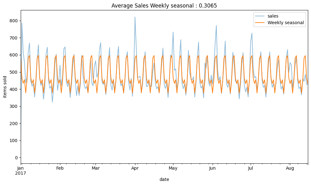
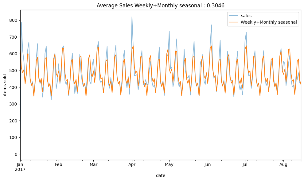
Based on the CalendarFourier, predicting sales with Fourier weekly freq seems to work well with the sales data.
Partial Autocorelation
Partial autocorrelation describes the correlation between observations of a time series separated by a specific number of periods, while controlling for or eliminating the influence of the correlations at shorter lags.
To check if a set of data has repeating patterns, we make "lagged" versions of the data. This is like moving the data forward a step or more.
# use .diff to compute the difference between an element and its previous element to make data stationary
plot_pacf(y.diff().dropna(), lags=8);
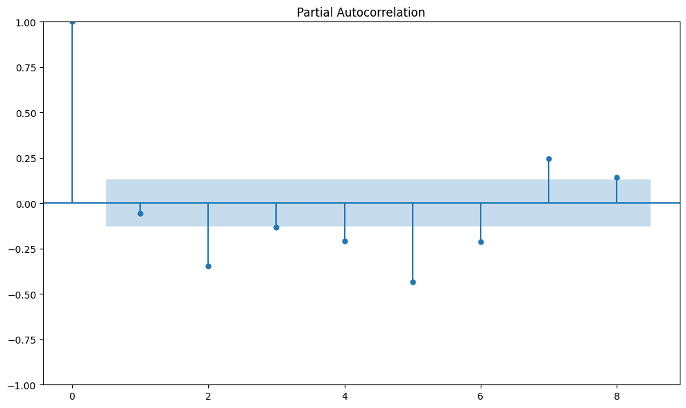
Based on the PACF, I'll add lag5 and lag7 to see if it makes the prediction model better.
dp = DeterministicProcess(
    y.index,
    constant=True,
    order=1,
    additional_terms=[fourier_W,fourier_M],
)

X = dp.in_sample()

X['lag5'] = y.shift(5)
X['lag5'] = X['lag5'].fillna(method='backfill')

X['lag7'] = y.shift(7)
X['lag7'] = X['lag7'].fillna(method='backfill')

model = LinearRegression().fit(X, y)
y_pred = pd.Series(
    model.predict(X),
    index=X.index,
    name='Fitted',
)

score = rmsle(y,y_pred)

y_pred = pd.Series(model.predict(X), index=X.index)
ax = y.plot(alpha=0.5, title=f"Average Sales : Weekly+Monthly seasonal+Lag {score:.4f}", ylabel="items sold")
ax = y_pred.plot(ax=ax, label=f"Weekly+Monthly seasonal+Lag")
ax.legend()
plt.show();
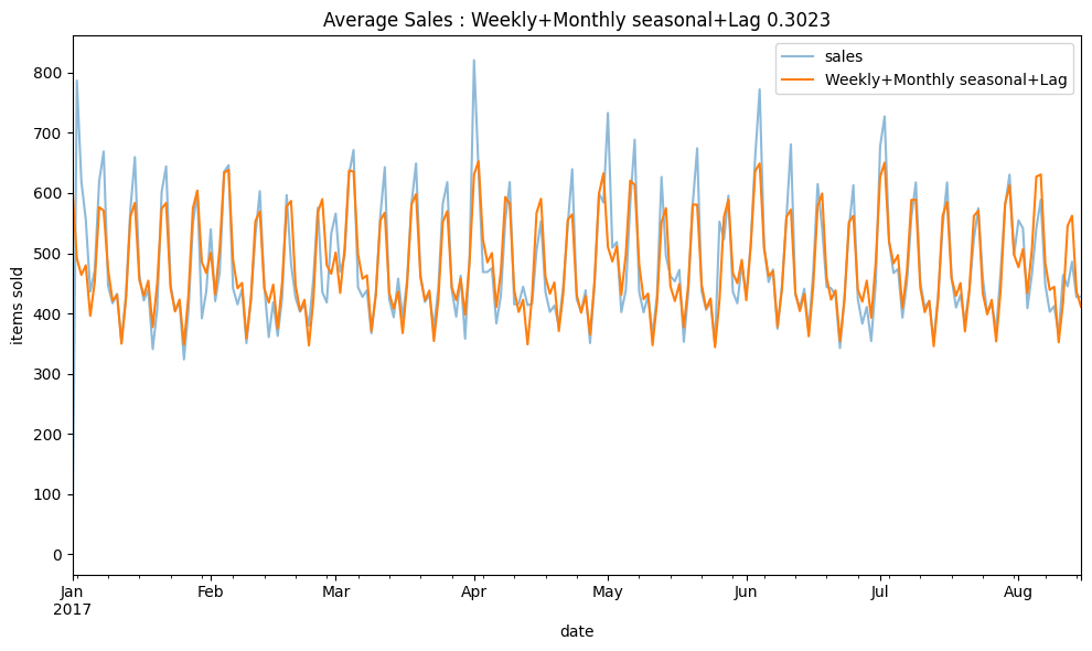
Conclusion
This project shows how to use Fourier methods to create seasonality features for predictions. Additionally, I use PACF to understand the correlation between lags.
Adding more relevant features like public holidays or outside factors like oil prices. Also, trying different models like XGBRegressor might help make our predictions more accurate.

Boston Housing Price Prediction with Streamlit on Docker
This project presents a Python-based machine learning application designed to predict housing prices in the Boston area.
The essence of the project lies not in the complexity of the machine learning model or advanced feature engineering, but rather in the effective deployment of the model into a web application.
Utilizing the classic Boston Housing dataset, the model is trained and then serialized using pickle, a method that simplifies deployment and is particularly accessible for those new to practical machine learning applications.
The deployment is facilitated through Docker, which efficiently packages the environment and dependencies, streamlining the distribution and execution of the web application developed with Streamlit. This web application offers an interactive interface where users can manipulate various parameters through slider menus to predict housing prices in Boston. The focus is on delivering real-time predictions, enhancing the user experience and demonstrating a practical application of machine learning models.
The web application can be accessed at : boston-housing-price.streamlit.app
The source code is available on GitHub Repo.
Tech Stack Used in the Project
- Python: A powerful and versatile programming language, serving as the backbone for the entire project. Its wide range of libraries and community support makes it an ideal choice for this application.
- Streamlit: An open-source Python library that simplifies the creation of web apps for machine learning and data science projects. It enables the seamless integration of Python code with a user-friendly web interface.
- Docker: A platform used to package, distribute, and run applications. Docker encapsulates the application and its environment, ensuring consistency across different development and deployment stages.
Running the Application with Docker
Visit my GitHub for instructions on how to Run the Application with Docker.
Accessing the App Without Docker
If you prefer not to use Docker, the Boston Housing Price Prediction app is also available on the Streamlit sharing platform.
You can access it directly at: boston-housing-price.streamlit.app
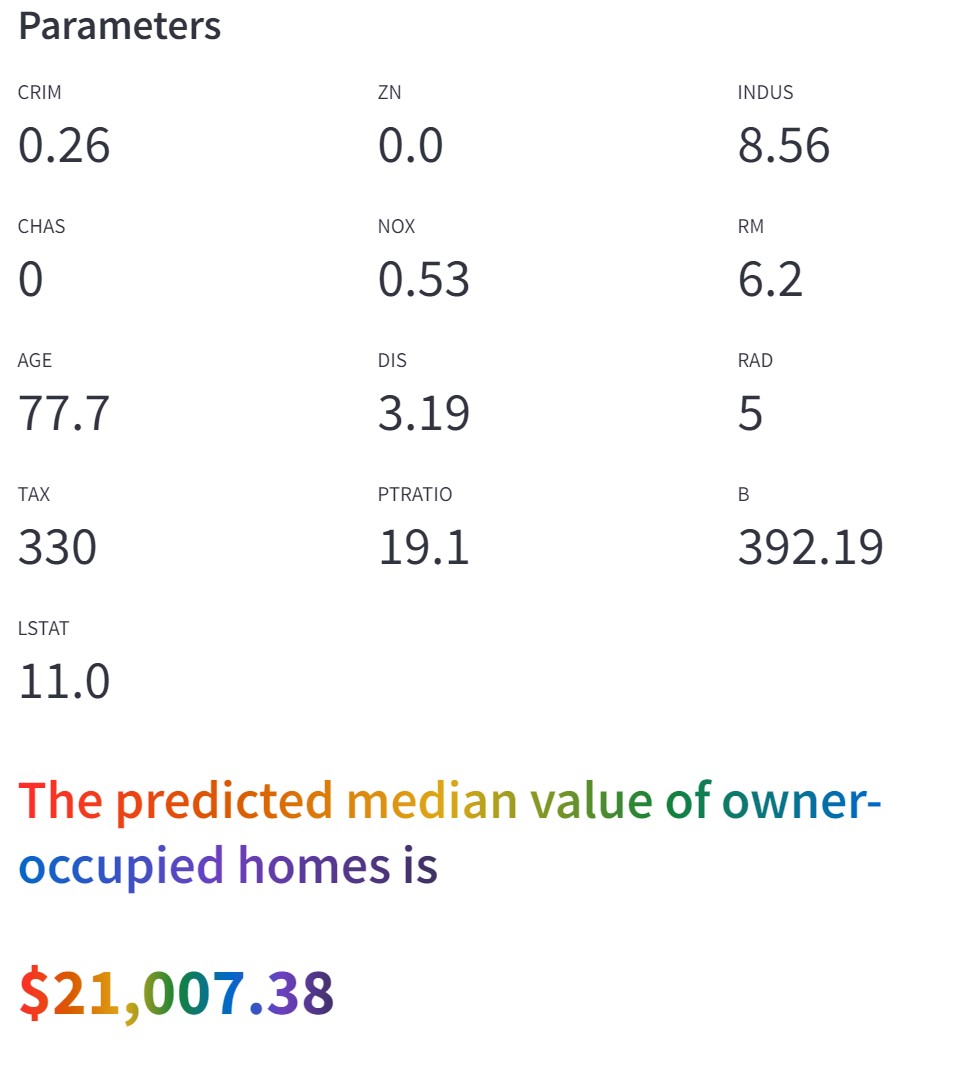
This interactive tool allows you to predict housing prices in Boston by adjusting various parameters. Utilize the slider menus on the left to modify key factors influencing housing prices.
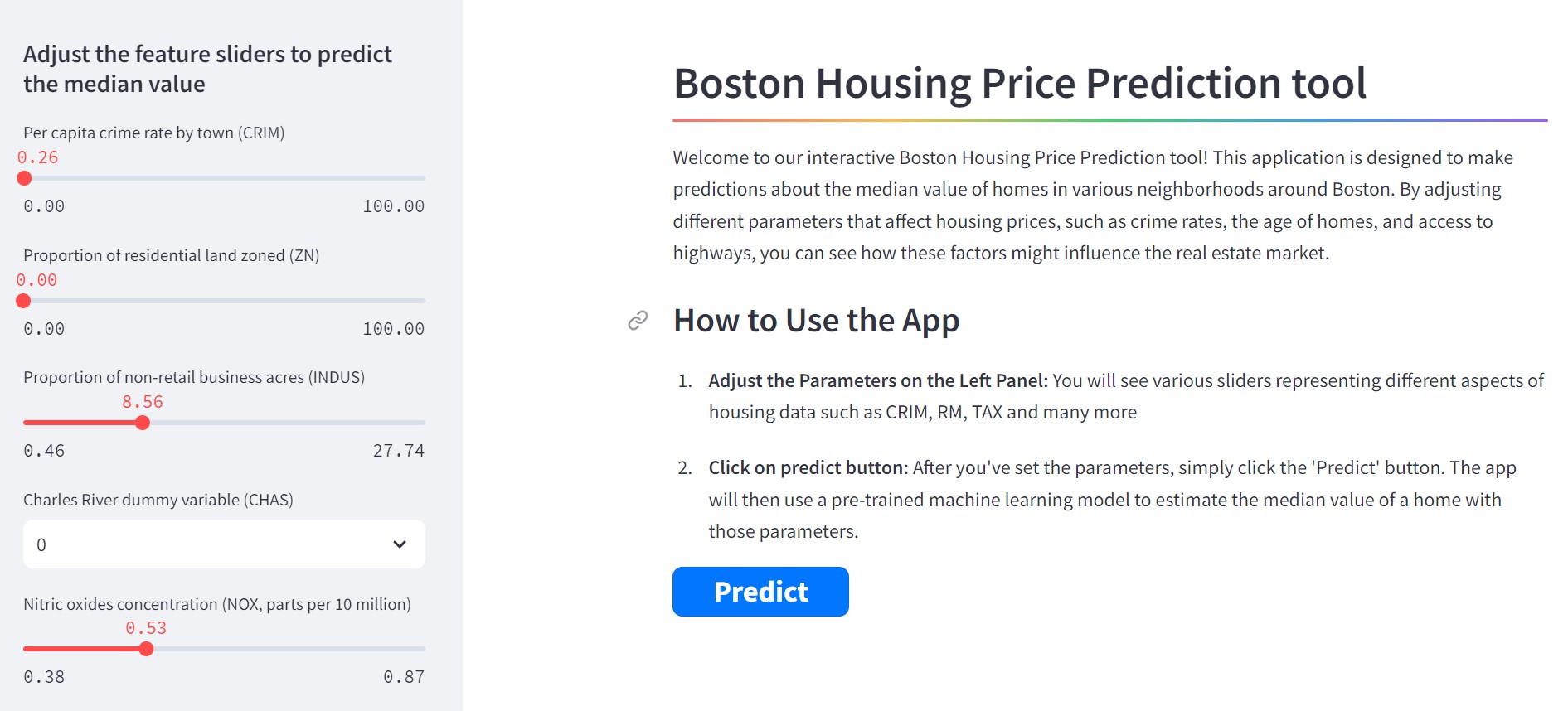
Once you have adjusted the settings to your satisfaction, click on the 'Predict' button to submit your chosen parameters to the machine learning model. Following this submission, the tool will display the predicted housing price. This prediction is shown a numerical value, allowing you to understand the potential housing price based on your selected criteria.

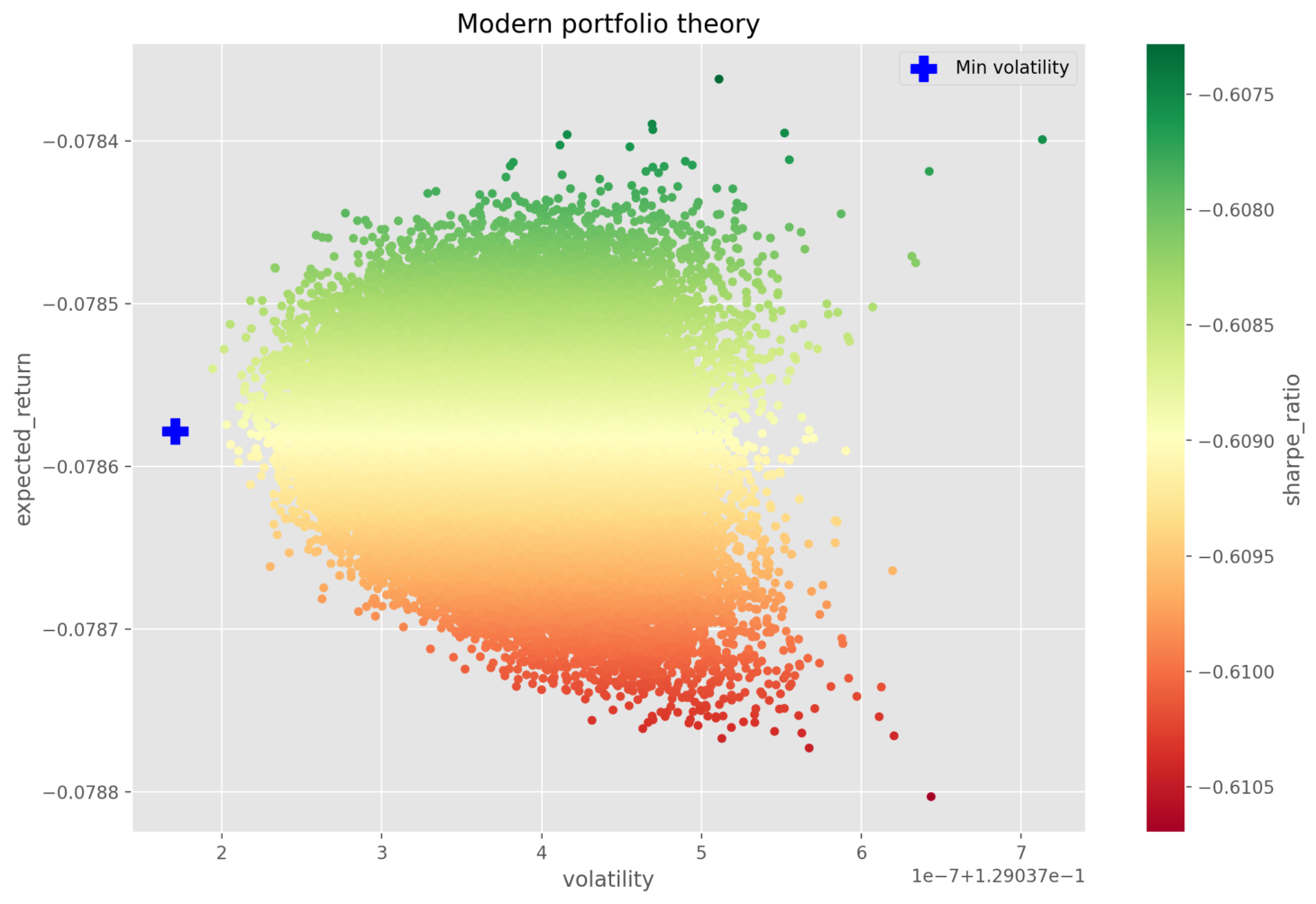
Modern Portfolio Theory in Python: Building an Optimal Portfolio Web App with Streamlit
Modern Portfolio Theory (MPT), first introduced by Harry Markowitz in 1952, has transformed investment portfolio management. This theory suggests that it is possible to build an 'optimal' portfolio that can offer the highest possible expected return for a given level of risk. It highlights the importance of diversifying assets with varying risk and return profiles.
The web application can be accessed at : modern-portfolio-theory.streamlit.app
The source code is available on GitHub Repo.
Applying MPT in Python Using Real Market Data
A Python-based tool employs a simple yet effective idea: randomizing the weight of each stock within a portfolio, thus applying the rule of large numbers to deduce the best weights for minimum volatility, maximum expected return, and an optimized Sharpe ratio. This is done by analyzing real S&P 500 data from January 2022 to October 2023.
Iterative Testing with S&P 500 Stocks
To find the best stock combinations from the S&P 500, the Python script repeatedly tests different mixes. The goal is to find the ideal combination that meets the criteria for minimum volatility, maximum expected return, and maximum Sharpe ratio. Due to the extensive computation required, this process is pre-processed to enhance efficiency.
Visualizing MPT with the Web Application
Despite the pre-processing, the Streamlit web application performs MPT by using these optimized stock combinations and weights to visually demonstrate the MPT algorithm, allowing users to see how different portfolios may perform.
Interactive Portfolio Customization
The web application offers users the ability to select the number of stocks in their portfolio and the optimization strategy they prefer, whether that's minimizing volatility, maximizing expected returns, or optimizing the Sharpe ratio, providing a tailored investment experience.

Interactive Resume AI
Interactive Resume AI is an innovative project designed to revolutionize the way resumes and professional profiles are accessed and interacted with. This project leverages the power of AI to create a dynamic and responsive experience for users seeking to explore professional profiles and resumes.
The web application can be accessed at : interactive-resume-ai.streamlit.app
The source code is available on GitHub Repo.
Concept
At its core, the Interactive Resume AI is built to integrate a user's resume and profile information within a vector database (Pinecone, for this project) facilitating efficient and relevant data retrieval. The integration with OpenAI allows for an advanced understanding and processing of user queries, ensuring accurate and relevant responses. Furthermore, the project is brought to life through a Streamlit-based web interface, offering an interactive and user-friendly platform.
Technology Stack
- LangChain Library - Facilitates the integration and interaction between different AI models and components. Key Features: Streamlines the development of language applications, supports chaining different AI models, provides tools for conversation handling and context management.
- Pinecone Vector Database - Stores and manages resume and profile data efficiently. Key Features: Fast search capabilities, scalability, and advanced vector indexing.
- OpenAI Integration - Processes natural language queries and constructs meaningful responses. Key Features: Advanced language understanding, context-aware processing.
- Streamlit Web Interface - Provides a user-friendly and interactive platform for users to interact with the AI. Key Features: Easy to build and deploy, supports rapid prototyping, highly interactive.
How it Works
When a user interacts with the Chat AI on our website, their queries are processed to search for relevant terms within the Pinecone vector database. This database contains structured information from resumes and profiles. The script then constructs a prompt based on this information, which is sent to OpenAI for processing. The response from OpenAI is then displayed to the user, providing a seamless and intuitive interaction experience.
Architecture
Indexing: a pipeline for ingesting data from a source and indexing it. This usually happen offline.
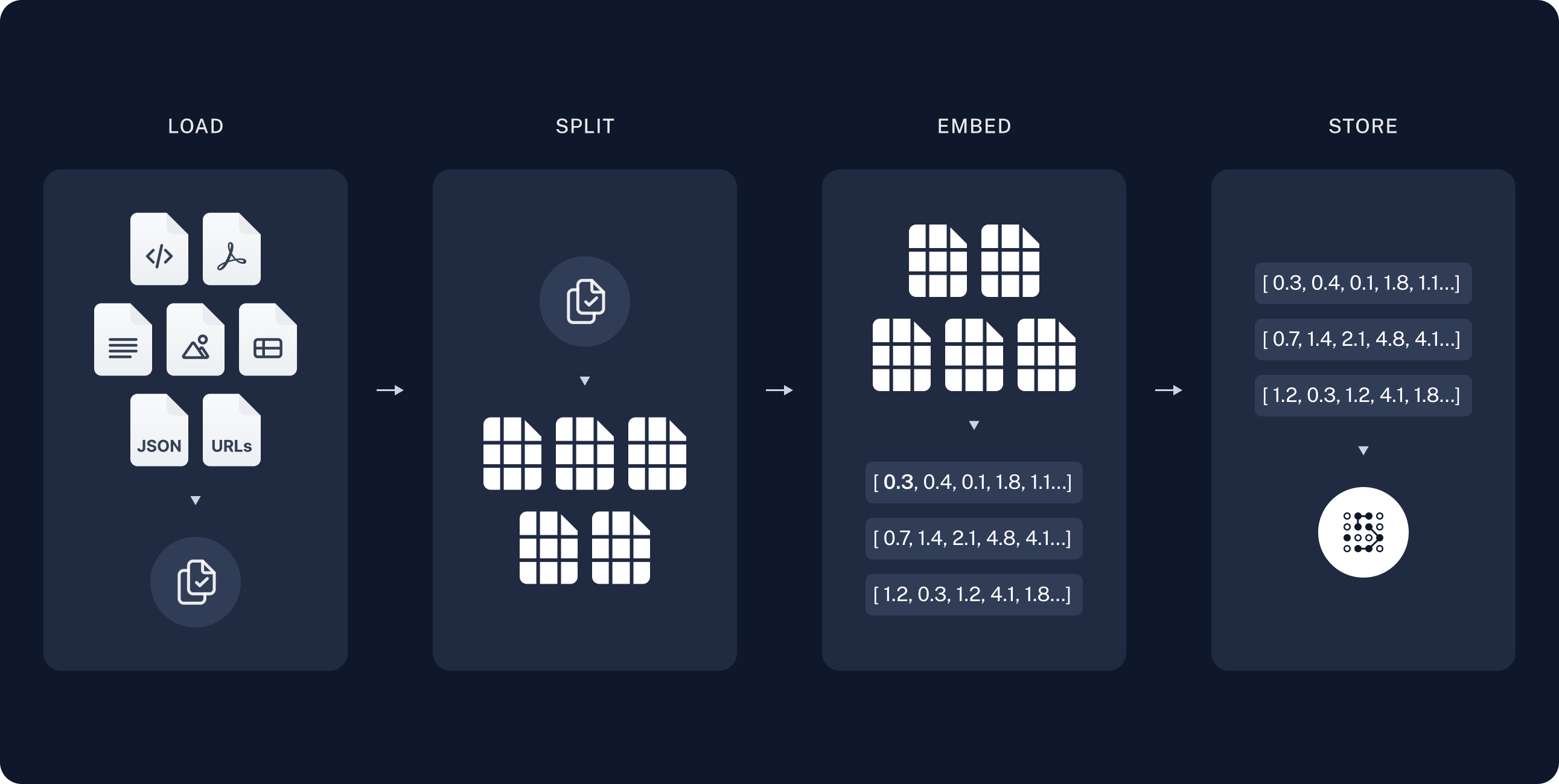
Retrieval and generation: the actual RAG chain, which takes the user query at run time and retrieves the relevant data from the index, then passes that to the model.

source : langchain.com
Data Preparation with OpenAI Embeddings
The initial step in preparing the Interactive Resume AI involves splitting the documents into manageable chunks and creating embeddings for all the documents - resumes and profiles or any relevant documents - that are to be stored in the vector database. This is achieved using OpenAI's Embeddings API.
When we pass text to the OpenAI Embeddings API, it returns a series of vectors, each having 1536 dimensions. These vectors are arrays consisting of 1536 floating point numbers. They represent the semantic essence of the text in a high-dimensional space, capturing intricate details and nuances of the content in each document.
Storing Data in Pinecone Vector Database
Once the embeddings are generated, they are inserted into the Pinecone vector database. This database is specifically configured with the same dimensionality of 1536 to match the embeddings created by OpenAI's API. The use of cosine similarity as the metric in Pinecone ensures that the similarity search is aligned with the nature of the embeddings, allowing for the most relevant and accurate matches based on the query.
- Vector Database - A vector database stores these vectors and allows for efficient querying and retrieval. It's optimized for the kinds of operations needed for high-dimensional vector data, which are not typically efficient in traditional relational databases.
- Similarity Search - One of the primary operations performed on a vector database is similarity search. This refers to finding the vectors in the database that are most similar to a given query vector.

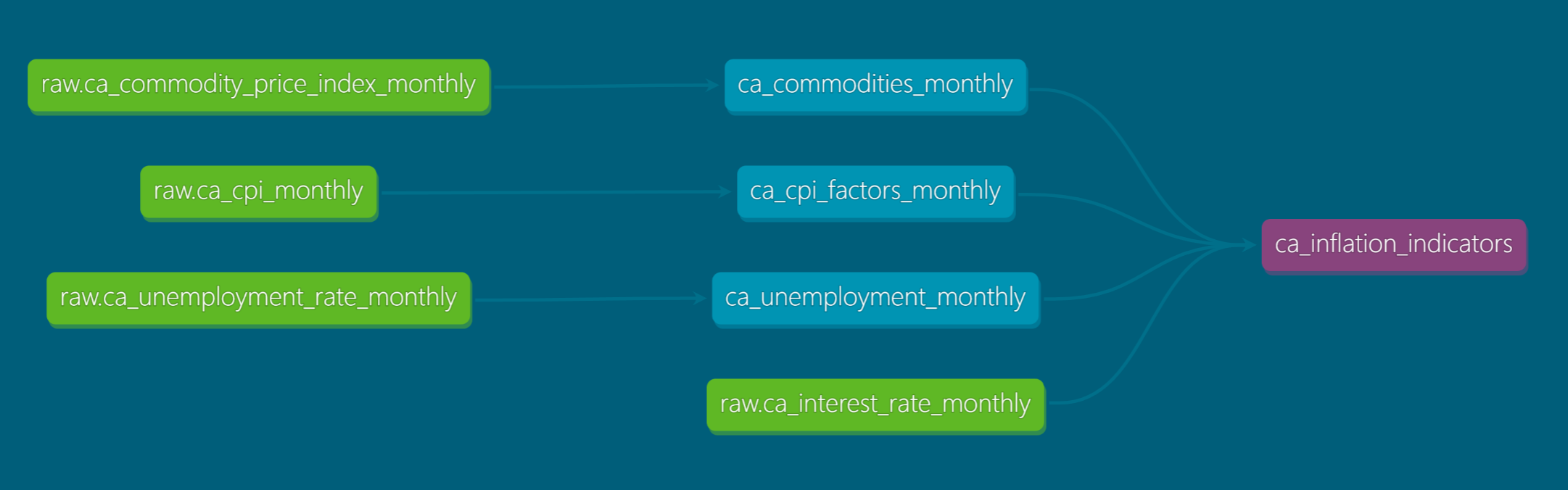
dbt Data Transformation Project - Extract, Load, Transform (ELT) - Canada Inflation Indicators
This project demonstrates the use of dbt, a SQL-first transformation workflow, for performing Extract, Load, and Transform (ELT) operations on various data sets. It showcases the power of dbt in handling data transformations using SQL, with source and version control managed through GitHub. Additionally, the project highlights dbt's capabilities in conducting Data Quality Testing using SQL queries.
Purpose
The primary objective of this project is to showcase the effective application of dbt in Extract, Load, and Transform (ELT) processes. The project emphasizes leveraging dbt to establish a structured and efficient approach for data transformation. Key focuses include:
- Structured Data Transformation: Utilizing dbt's capabilities to systematically transform data, thereby enhancing the organization and clarity of the data transformation workflow.
- Ensuring Data Quality: Implementing dbt's testing features to maintain high standards of data integrity and accuracy throughout the transformation process.
- Code Consistency and Efficiency: Employing dbt to ensure that the code used for data transformation is not only consistent across various models but also optimized for efficiency.
- This project serves as a practical demonstration of how dbt can streamline ELT processes, making them more reliable, maintainable, and scalable.
Tools and Technologies
- dbt: Used for data transformation and testing.
- SQL: Primary language for defining data transformations.
- GitHub: For source and version control.
- Google BigQuery: Data warehousing solution where the transformed data is loaded.
- Jinja Templates: Utilized in dbt for efficient SQL code management.
Lineage Graph
Explore the Full Source Code on GitHub
For a detailed look at this project, including the complete source code and an extensive README, visit my GitHub repository. Whether you're interested in the technical details, want to build upon the project, or simply curious, you'll find everything you need there.
🔗 View GitHub Repository.